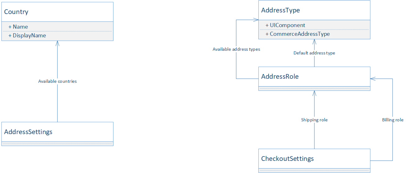
Address types
Mercury supports configurable address types. These address types have their own UI components and allow you to have different address fields for specific address types. For example, for a shipping address it can make sense to add a floor field. However, this doesn't make a lot of sense for a billing address. By default Mercury only has a single address type, but new address types can easily be added.
Design
Model
An address type has a UI component name and a commerce address type. The UI component name is the technical name of the UI component that represents the given address type in the UI. The commerce address type is the integer value that is used to indicate the address type in the Commerce Profile System.
Address roles indicate what address types can be used for certain roles. An address role has a default address type and a list of available address types. The default address typed is used when a new address is added in the context of the role. The available address types list is used to determine what addresses to show to the user.
Addresses can also be country specific. A list of available countries is shown in a drop down when the user adds a new address.
Functionality
Address book for certain address type
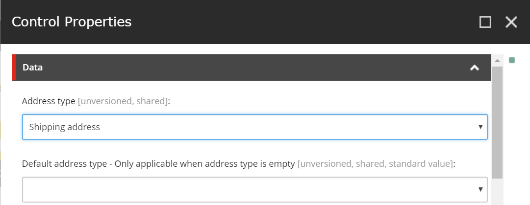
The address book in the "my account" section can be shown for a specific address type. This is configured in the rendering parameters of the addresses rendering. If no address type is selected, all address types will be shown. However, in this case the default address type needs to have a value. The value is used to decide which address to use when adding a new address in the address book.
Registration with new address
The Register rendering also supports adding a new address. The address type for this address can be configured on the rendering parameters of the Register rendering, this address type field is mandatory for this rendering.
Use address roles in checkout
The checkout supports two types of addresses: Billing and a Shipping, which can be mapped to custom address roles. The checkout settings, an item based on the /sitecore/templates/Mercury/Foundation/Checkout/Settings/CheckoutSettings template, has fields for configuring the address roles for these two types of addresses.
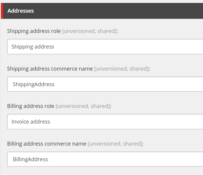
The shipping address role indicates what role is used for the shipping address. The billing address role indicates what role is used for the billing address. These roles are used to determine what address types will be shown in the checkout. The accompanying commerce name fields are technical fields and used to indicate what the address type name of the addresses on the Commerce Cart & Commerce Order will be.
Extension points
Create custom address type
Extend the relevant entities
Follow the instructions in the Extending address page on how to extend the relevant address entities. So that any needed additional address fields are persisted.
Register the address type
Create new address type based on the template: /sitecore/templates/Mercury/Foundation/Address/Address Types/AddressType and provide values for the address type UI name and commerce address type number.
Configure the address role
If a new address role is needed, create a new item based on the template: /sitecore/templates/Mercury/Foundation/Address/AddressRole/AddressRole. Add the address type in the settings of the new or existing address role.
Create the custom UI components
A custom address type needs both a component for modifying the address and a component for displaying a readonly version of the address type.
The readonly component only receives the address itself through its props:
    propTypes: {
        address: React.PropTypes.object
    },
The readonly component can use whatever it needs to display the address.
The edit component needs to render the address type specific fields for editing using the Mercury form fields. Internally Mercury uses Formsy for this and offers a lot of components out of the box. For example this is the edit component for the default Belgian addresses:
var EditAddressBE = React.createClass({
    mixins: [CheckoutMixin],
    propTypes: {
        model: React.PropTypes.object,
        addressType: React.PropTypes.string
    },
    render: function () {
        return (
            <div className="row">
                <Input name="zipPostalCode" value={this.props.model.zipPostalCode}
                       labelSource="mercury-address-be-zipLabel"
                       labelDefaultText="Zip / Postal Code" type="text" autoCompleteBlock={this.props.addressType}
                       validationSource="mercury-address-be-invalidZip"
                       defaultValidationText="Please enter your zip / postal code"
                       placeholderSource="mercury-address-be-placeholder-zipPostalCode"
                       placeholderDefaultText="Zip / Postal Code"
                       validations={{minLength:1, maxLength:4,matchRegexp:/^[1-9][0-9]{3}$/}}
                       wrapperClass={this.getColumnsClasses('zipPostalCode')}
                       required/>

                <Input name="houseNumber" value={this.props.model.houseNumber ? String(this.props.model.houseNumber) : ''}
                       labelSource="mercury-address-be-houseNumberLabel"
                       labelDefaultText="HouseNumber" type="number" autoCompleteBlock={this.props.addressType}
                       validationSource="mercury-address-be-invalidHouseNumber" validations={{ maxLength:10}}
                       defaultValidationText="Please enter your house number"
                       wrapperClass={this.getColumnsClasses('houseNumber')}
                       placeholderSource="mercury-address-be-placeholder-houseNumber"
                       placeholderDefaultText="House number"
                       required/>

                <Input name="addition" value={this.props.model.addition} labelSource="mercury-address-be-addition"
                       labelDefaultText="Addition" type="text" autoCompleteBlock={this.props.addressType}
                       validationSource="mercury-address-be-addition" validations={{ maxLength:10}}
                       defaultValidationText="Please enter an addition"
                       wrapperClass={this.getColumnsClasses('addition')}
                       placeholderSource="mercury-address-be-placeholder-addition"
                       placeholderDefaultText="Addition"
                />

                <Input name="address1" value={this.props.model.address1} labelSource="mercury-address-be-address1Label"
                       labelDefaultText="Address" type="text" autoCompleteBlock={this.props.addressType}
                       validationSource="mercury-address-be-invalidAddress1"
                       defaultValidationText="Please enter your first address line"
                       placeholderSource="mercury-address-be-placeholder-address1"
                       placeholderDefaultText="Street"
                       validations={{maxLength:80}}
                       wrapperClass={this.getColumnsClasses('address1')}
                       required/>

                <Input name="city" value={this.props.model.city} labelSource="mercury-address-be-cityLabel"
                       labelDefaultText="City" type="text" autoCompleteBlock={this.props.addressType}
                       validationSource="mercury-address-be-invalidCity"
                       defaultValidationText="Please enter your city"
                       placeholderSource="mercury-address-be-placeholder-city"
                       placeholderDefaultText="City"
                       validations={{ maxLength:64}}
                       wrapperClass={this.getColumnsClasses('city')}
                       required/>
            </div>);
    }
});
The custom UI components can also be country specific. Registering the custom UI components can be done as follows:
mercuryAddress.registerForType("shipping", "nl",
    () => require('./components/shippingAddress-nl-read')
    () => require('./components/shippingAddress-nl-write')
);
The first parameter is the UI component name of the address type, which is configured in the address type settings in Sitecore. The second parameter is the supported country. The third parameter is the read component and the fourth the write parameters.
Create country specific address UI component
To do this follow the same steps as defined in the previous paragraph.